Even though transactional emails see 8x more opens and clicks than any other type of email — and can generate 6x more revenue — it’s shocking to see how many companies fall short. In our unboxing blog series we take a look at the transactional emails of the biggest and most popular retailers. Join us to see what’s working, what’s not, and apply these learnings to your own transactional emails.
Thoughts on Banana Republic
The Banana Republic Travel & Safari Clothing Company was a safari-themed clothing and accessories retailer founded in 1978 by Mel and Patricia Ziegler. In 1983, the company was purchased by Gap, Inc. who shortened the name to Banana Republic, and gave it a more upscale image. Today Banana Republic operates about 600 brick-and-mortar stores internationally, as well as bananarepublic.com.
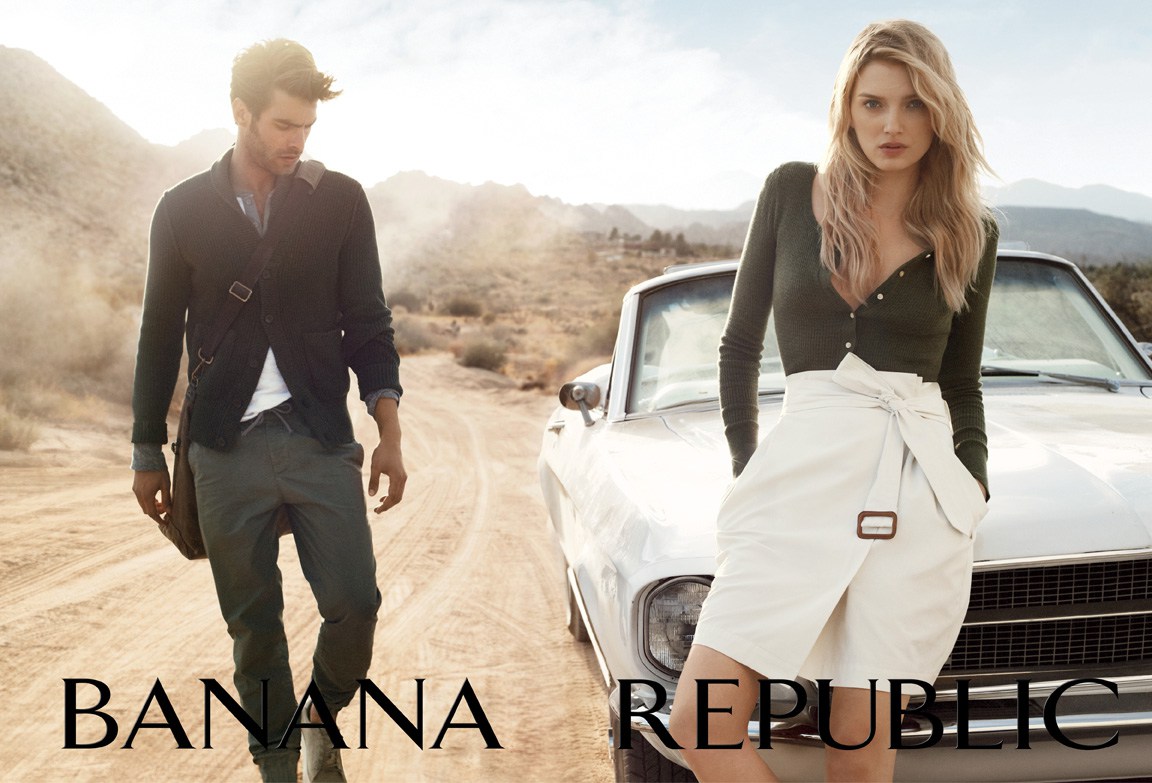
While Banana Republic may have kicked the safari theme, it’s clear that they’re still marketing to a sophisticated, travel-minded audience. The base imagery from their seasonal “Come Together” campaign features a mostly young, diverse group of people sharing a meal outdoors in a muted, coastal setting. They’re even promoting a blog called “The Subtle Things: Men’s Fashion & Travel Blog.” We saw a similar travel angle from Anthropologie.
Banana Republic’s ads, emails and website all evoke a feeling of simple, everyday elegance. By using models who look like real people, they make their products seems more accessible, which is smart, given their higher price points. Banana Republic advertises their clothing and accessories as perfect for going from the office to dinner, from day to night.

You Heard Right: 46 Emails in 30 Days
Do Banana Republic’s transactional emails give the same sophisticated, professional feeling as their marketing efforts? The MailCharts data team tested this question by purchasing a pair of trouser socks for $3.59 plus shipping.
Today we’ll unbox not only the product, but the email purchase experience as well. From the time of purchase through the first 30 days, Banana Republic sent us a whopping 46 emails, which is by far the most aggressive number that we’ve seen so far in our unboxing series.
To see more of the Banana Republic emails sent to a purchaser, as well as the timing and delay between emails, sign up for MailCharts.
Now we’ll take a deep dive into three of Banana Republic’s transactional emails.
An Order Confirmation That’s Doing Too Much

Right off the bat, we can see that there’s a lot going on in this email.
Before we even get to our order information (which is the reason for this email), we are served up a hefty dose of copy in the form of FAQs. Don’t get us wrong, we love FAQs in transactional emails, but for these we’d recommend condensing and making them secondary by placing them lower in the email.
Meanwhile, we’ve got five promotional graphics running down the right rail, two for Banana Republic and three cross-promotional ads for other Gap, Inc. companies. When you pair these with the header, FAQs, order summary, “BRFriends” SMS promotion and footer, there is simply too much they are trying to do here. It almost feels as if delivering our order confirmation details is an afterthought for them.
However, all of our key information is here. Next we’ll skip over the shipping notification email and look at their “update your preferences” email which arrived the next day.
A Clever Call for Preference Updates

This next email switches things up a bit.
The design and creative are clean and on-brand. And we love how Banana Republic turns the typical “update your preferences (so we can better market to you and make more money)” into the very clever “What’s your story?” It’s just a small amount of copy, but it shifts the feeling entirely. Asking a question and letting us know what’s in it for us is a great way to motivate users to act.
From there we have the social icons and below that, the cross-brand promotion, which, with the simple treatment of logos and placement in the footer, does not feel nearly as aggressive as the full graphics in the previous email. Well done.
Next we’ll look at an email solely dedicated to the same cross-brand promotion. This one came nine days later.
Cross-Promotion Everywhere!

We’ve already seen heavy cross-promotion between sister brands in our Banana Republic emails, but this one takes it to a new level. The basic message with this email is, “Did you know we also own Gap and Old Navy? Here’s a discount, shop now.”
Our biggest question for this positioning is: If these brands are so closely tied together, why not just have one brand? We obviously just bought from Banana Republic, but they aren’t doing much to build a relationship with us nor build brand loyalty. This email makes it feel like they are just trying to push product down our throats with reckless abandon.
There a reason each of the Gap, Inc. companies have their own brand. We think they should try a bit harder to make each one stand out for what they truly are.
Banana Republic’s Unboxing Experience

We like the copy on this packaging, “Style, delivered.” It’s not surprising either, given what we’ve seen in Banana Republic’s transactional emails, that the packaging is co-branded with Gap, Old Navy and Athleta.


Pretty simple: Packing slip and product.
Parting Thoughts
Throughout this experience we saw several missed opportunities for Banana Republic to build loyalty and foster a relationship with its customers. Instead, they seem much more interested in promoting their sister brands, which may make more money for Gap, Inc., but at what cost?
We did, however, see a lot of potential with attractive photography and clever copy. A little more focus and these emails could really go places.
To see more emails from Banana Republic’s purchase experience and to find detailed email insights from 30,000+ other companies, join MailCharts today!


