Mailcharts analyzes the email behavior of thousands of retailers. In doing so, we’ve realized that companies spend an incredible amount of time creating and optimizing newsletters and one-off campaigns but often fail to create beautiful—and memorable—transactional emails.
Because transactional emails are opened 4-8 times more often than other emails, this is an area marketers should focus on. Think about it this way: you need to do everything you can to turn first-time purchasers into lifelong ones.
In today’s post we’ll analyze Birchbox’s purchaser email journey. This journey will help you understand what works, and what doesn’t, so you can apply these takeaways to your own emails.
Key takeaways
- The shipment confirmation email was sent less than three hours after placing the order.
- A “Thank You” email—featuring free shipping on our next order—was sent a day after the product shipped.
- Birchbox’s emails are nice and simple. Unfortunately, there are many design inconsistencies from one email to the next.
- Log into MailCharts to view Birchbox’s full purchaser email journey.
Order confirmation email
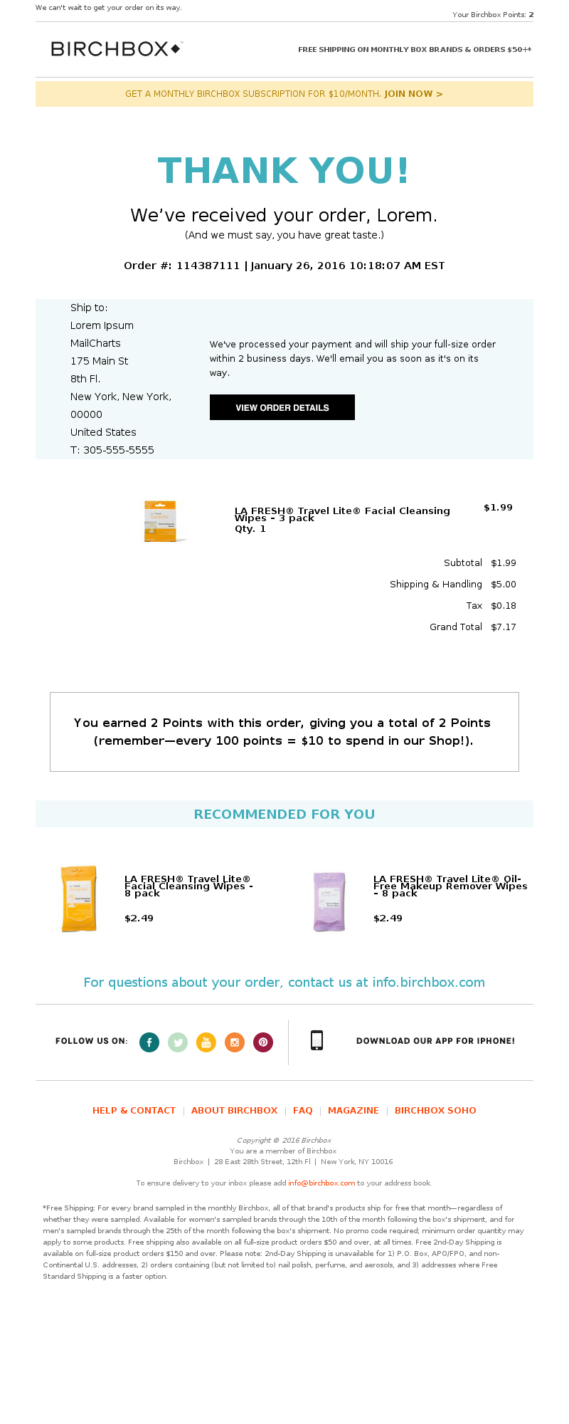
Birchbox: New Order # 114387111
Birchbox’s order confirmation email is simple and effective—and we loved the prominent “THANK YOU!”.
Notice how Birchbox outlines the maximum shipping time for our order. They also mention we’ll receive a shipping confirmation email once the order has shipped.
Lastly, Birchbox takes full advantage of the higher open rate typically associated with transactional emails by encouraging repeat business. Notice how they highlight their point system and rewards. The bottom of the email also includes a “Recommended for you” section showcasing similar products.
That’s the key: they’re promoting similar products.
While their order confirmation email is effective, it could be improved by including the payment details—such as the last 4 digits of the credit card—and making the email’s subject line a bit warmer. Take a look at this email from Peter Millar. Notice the appealing subject line and payment method section.
Shipping confirmation email
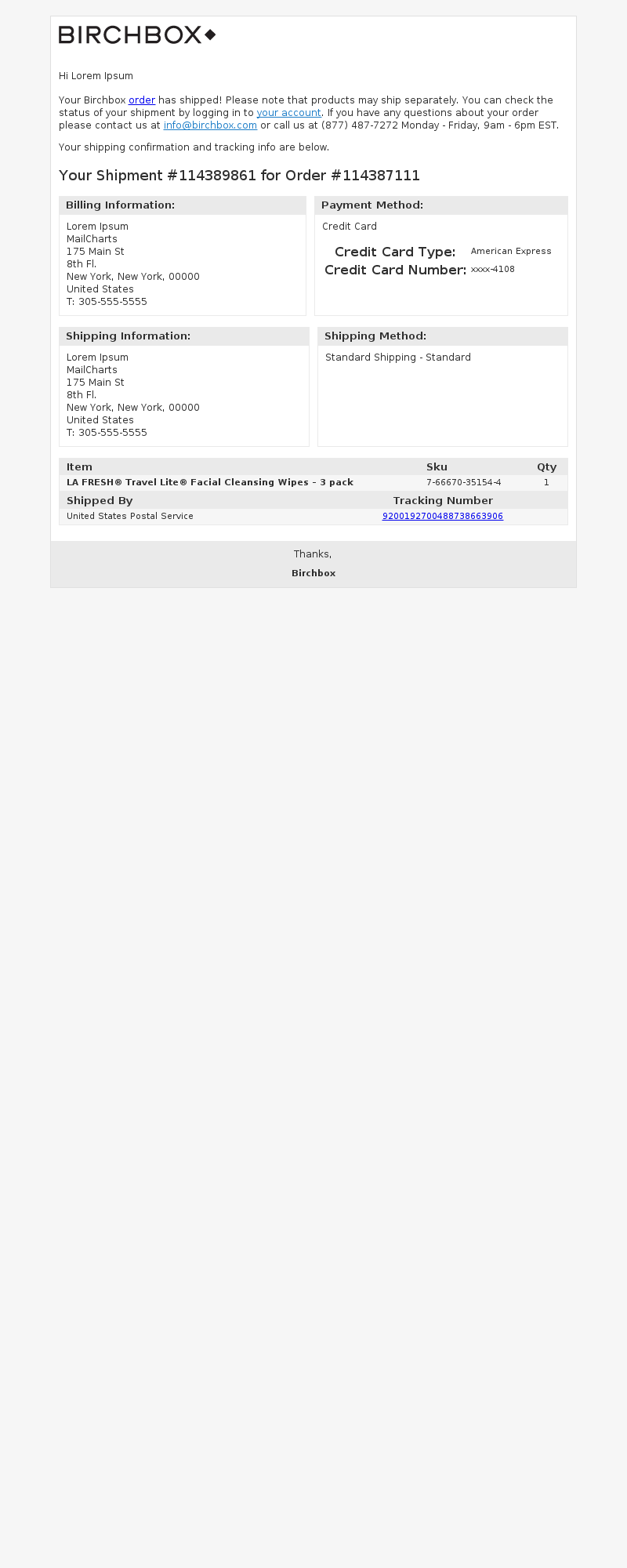
Birchbox: Shipment # 114389861 for Order # 114387111
Design wise, this shipping confirmation order looks “meh”. It’s your standard, run of the mill shipment confirmation email.
Design aesthetics aside, this email does provide all the necessary information including: shipping address, billing information, payment method, contact numbers, product details, and tracking number.
Pro tip: Emphasize the tracking number. If your customers are like me, that’s the only thing they care about when opening this email. Kudos to Birchbox for making the tracking number clickable.
Post-purchase email
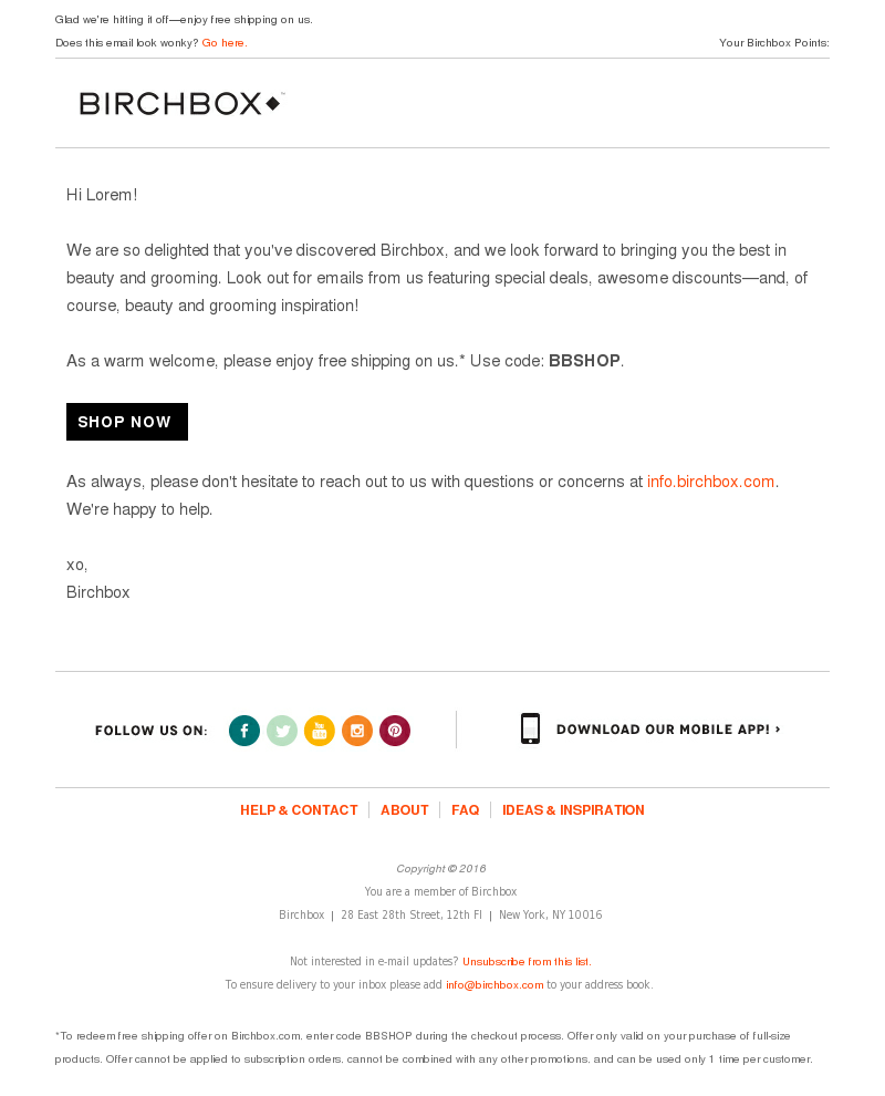
We're So Happy You Found Us!
A day after receiving the shipping confirmation email, Birchbox sends an follow up email with the eye catching subject line “we’re so happy you found us”. The email does two things really well:
- Most importantly, this email sets expectations for upcoming emails. They specifically mention that they’ll be sending us deals (and grooming content). Consider adding something similar to your email program.
- They encourage you to complete a second order by offering free shipping. I like that they’re not too pushy and don’t offer a massive discount. Doing so would reframe how I think of them (“Oh, these guys discount all the time. I’ll wait for an offer and avoid paying full price on my future orders!”).
The next big industry shift: segmentation
Now that we’ve had a good look at the Birchbox unboxing experience, let’s look at the campaigns they send on a daily basis.
When it comes to email marketing, segmentation is crucial. Just like we saw with the rise of mobile optimization and conversational emails (that include animated GIFs and emojis), we predict that the next big shift in our industry will be to segmentation and personalization.
And as it turns out, there’s data to prove why this makes business sense: 24% of segmented emails experienced greater revenue and deliverability while 39% experienced higher open rates.
Every customer is different and, therefore, should receive emails tailored to them. Take previous purchasers, for example. They may need less convincing (aka: a lower discount) than older, unengaged subscribers.
The Birchbox segmentation report
As we saw in this post, MailCharts tracks different types of registrations (e.g. a purchaser). An incredible byproduct of tracking different registration types is that we can now compare how a company like Birchbox breaks out its segmentation strategy.
If you click through to our Birchbox segmentation comparison persona report you can see that most of the brand’s emails were the same for all segments: generic subscribers, cart abandoners and purchasers. Improving their segmentation strategy is a great opportunity for the Birchbox team. We wonder if this is something they’ll tackle in 2017.
Birchbox has a great brand, but they’ve dropped the ball in the shipping confirmation email.
Keeping a consistent design from newsletters to transactional emails allows you to build a strong and memorable brand. For a great shipping confirmation email example, check out this Boden email. It’s spot on!
Here’s your challenge: purchase from your company and your top 3 competitors. Go through each company’s email program—we guarantee you’ll find improvement opportunities.


