Email design is like television: In the beginning, it was black and white. Then the technology changed and TVs went live in living color. But some people still prefer the simplicity and artistic possibilities of B&W.
HTML gives email its color, animation, interactivity, and trackability. True plain text—which was your only option in the early days—doesn’t have them. For many HTML-averse email users, especially in tech and B2B, that’s part of the appeal.
Here’s an excerpt of a true plain-text email sent in 2006:

And here’s that same newsletter but now in an HTML version from 2023:

Even in this age of heightened privacy concerns, nobody is predicting we’ll return to the true plain text days of yore. Instead, many email designers use a minimalist approach—designing a simple template in HTML with maybe a logo or product image, a call-to-action button, and not much else.
These simpler, lighter-weight emails usually have fewer rendering issues, load faster, and might be less likely to trigger spam filters, as long as they follow standard coding practices. So they often show up as must-deliver messages like confirmations, system alerts, or breaking news.
A minimalist email can be an intriguing alternative to your regular HTML templates. But they need just as much special handling to make sure your message comes across clearly. These tips can help you create plain emails that still drive value for you and your customers.
Check this MailCharts resource: There are a lot of unattractive plain text or minimalist emails out there. You won’t find them on our Plain Text Email list of 22 hand-picked examples. For free-tier MailCharts users, we’ve unlocked it for a short time, so visit it now and save some emails to a personal list..
1. Is it plain text or is it minimalist?
True plain-text email has no images, and no colors except for the link color that the reader’s email browser assigns to clicked links and a typeface that follows your recipient’s email browser or device settings. You might envision it rendering in Arial, but if your recipient loves Comic Sans—well, sorry about that.
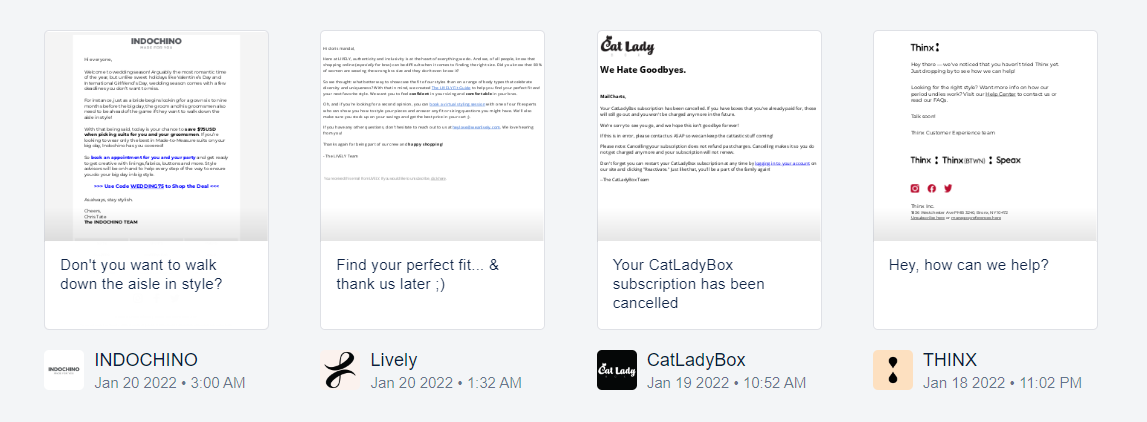
What passes for plain text today is a minimalist design that looks like plain text but specifies elements like font faces, sizes and colors, embedded links, and other basic HTML styling. This Thinx email mixes font weights, generous white space, and minimal images for a scannable message.
2. White space, content blocks matter more
Whether you’re creating a true plain text email or a minimalist version of your HTML, you’ll need lots of white space to highlight key copy and set off links. This DevaCurl email positions a customer’s two action choices side by side, using ample white space to make them stand out and be tapped easily. Another tip: Short sentences set off with bullet points to attract attention and highlight your key points..
Take a journey: Many brands use plain text/minimalist emails as key messages in journeys, especially in onboarding or purchase confirmations. Visit the Journeys homepage on MailCharts.com, and use the brand or journey filters to start your search for messages. Then, share your finds with your team members.
3. When to choose plain emails over heavy-format message templates
When you really need to capture attention fast, a true plain-text email or a minimalistic HTML format could be the way to go. Full-featured HTML emails can create a better brand or customer experience, but sometimes the copy is more important than a gorgeous hero image. Knit Crate’s minimalist email can go out quickly to alert customers and help them avoid disappointment.
Also consider: Line length matters in plain text for maximum readability. If you’re sending a simple email via HTML, you can specify the line length. In a true plain text email, where responsive design might not work, use hard returns to force shorter and more readable line lengths.
4. Check your multi-part MIME format
You’re probably sending plain-text emails without realizing it! Good design practice is to create both an HTML message and a plain-text version that is essentially the raw copy without the HTML styles. Most email clients will select the version that it supports or the one that a user’s settings specify.
Many plain-text versions look atrocious when the message designer hasn’t done at least some formatting for white space and line length. If you send multi-part MIME email but haven’t reviewed the settings for your plain-text version, now is a good time to check it out.
Next steps: seek email inspiration and test it for yourself
Plain text or minimalist design can give your emails a smooth, sleek appearance, one in which your copy shines bright because it doesn’t have distracting elements like images or animation to distract viewers.
Check out our examples of plain-text emails to discover what’s possible. Then, create and test a plain-text email to see whether it gets the attention and engagement that might have gotten lost amid the bells and whistles of today’s HTML design.
If you’re looking for more email design ideas, sign up for a free MailCharts account today.


