Account confirmation email examples
Short, sweet, and to the point. Typically, account confirmation emails are clear and ask for an opt-in, account creation or subscription.
Explore all 130 account confirmation emails
for MailCharts to discover account confirmation campaigns and inspired!
Pro tip: Scroll down for hand-picked emails.
The General Data Protection Regulation (GDPR) has a hot topic in the email world since taking effect in 2018. ’s now more important than ever for companies to ask users if they’d like to opt-in to receive communication. These emails are very similar to or shipping emails: They’re short, sweet, and to the point. Typically, the call to action is clear and asks for users to opt-in again to the account creation or .
View confirmation emails and strategies
- 1 Reduce copy and make the CTA button the focus
- 2 Bring users back to the website with product links
- 3 Invite users to fill out their communication preferences
- 4 Use fun GIFs or emojis
- 5 Provide contact details
- 6 Send the confirmation when the process is completed
- 7 Don’t forget to say “Thanks”!
- 8 Share helpful tips
- 9 Create a checklist
- 10 Mention the welcome offer in the subject line
- 11 Start the branding process right away
- 12 Make activation easy
- 13 Ask inactive customer to verify their accounts – again
Learn how to create account confirmation campaigns

Want to explore account confirmation emails?
for MailCharts to discover account confirmation campaigns and inspired!
Confirmation Email Examples & Strategies
’s important to keep account emails brief to drive the most conversions. If users don’t the action, companies don’t keep the data submitted which could lead to lost sale
Reduce copy and make the CTA button the focus
With mobile accounting for at least 50% of all email opens, cutting down on copy and focusing on the CTA can help increase conversions when comes to account emails. Take Thinx for example. They use a simple design and a button that contrasts nicely with the white background in the email. There are no frills, just simple messaging.
Sign up free for 130 curated examples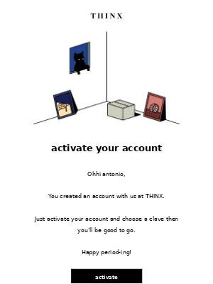
Bring users back to the website with product links
Some companies use the account email to link users to the website through headers or links below the CTA. Here’s a email example from the clothing company PrettyLittleThing. In addition to the clear opt-in language, it also guides users to different clothing categories on the website.
Sign up free for 130 curated examples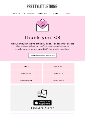
Invite users to fill out their communication preferences
In addition to confirming a customer’s account, preference centers allow companies to retain users for specific email communication while excluding them from others. For example, shoe company Durango uses the email to confirm a as well as the level of engagement a customer would like to receive.
Sign up free for 130 curated examples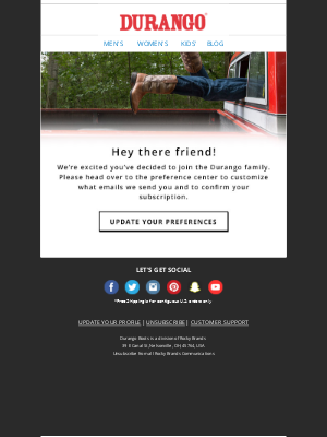
Use fun GIFs or emojis
The account email doesn’t have to be boring. TheraBox used a fun gif in their email to suggest that there’s an extra step to be completed – confirming the email address. TheraBox also quickly reminded the customer that they’ll receive a 10% off coupon when they complete the process.
Sign up free for 130 curated examples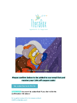
Provide contact details
Double opt-in and email confirming process can be confusing, so providing extra help is important. Michael Kors included “CONTACT US” CTA in their account email and encouraged customers to reach with or comments.
Sign up free for 130 curated examples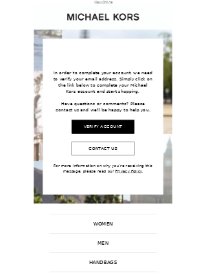
Send the confirmation when the process is completed
After the account has activated, send a email. Sleep number sends a short email with no CTAs that informs the customer about the successful activation.
Sign up free for 130 curated examples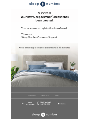
Don’t forget to say “Thanks”!
A email may be one of the first contacts that a customer has with your brand and it’s a good opportunity to create a good first impression. Clothing brand bebe shows gratitude and appreciation by starting the email with a quick “Thank you” note and then proceeds with account instructions.
Sign up free for 130 curated examples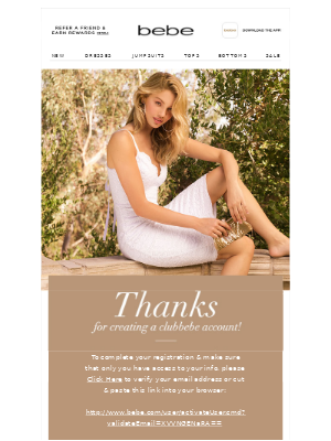
Create a checklist
Stove Supermarket has a creative strategy – they send a checklist that navigates new customers from account activation to the first . At the bottom of the email, they are listing popular product images and links, for inspiration.
Sign up free for 130 curated examples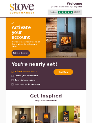
Mention the welcome offer in the subject line
To encourage the customers to open the email and confirm their email address, Christmas Tree Shops is mentioning the welcome offer in the subject line. Then, in the email, they list some of the other perks that will be after the email address is confirmed.
Sign up free for 130 curated examples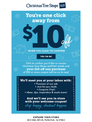
Start the branding process right away
Too many brands send basic requests that sound as if a robot wrote them. That’s a wasted opportunity! The very first email send your new customers – even one as workaday as an account – is your first step in building brand equity. This Frank Body email example goes full-on branding, with logo, brand colors, artwork and a quick recap of benefits.
Sign up free for 130 curated examples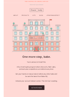
Make activation easy
Make as easy as possible for your customers to click your activation link. The call to action button in this Kidbox email might look extreme – but ‘s hard to , unlike a smaller button or a text link. Adding a model making eye contact with your reader also captures attention. Testing tip: This CTA sample uses “Set My Passport,” not “Activate My Account.” Testing can show you which CTA drives the most activations! (See the subject line strategy section below.)
Sign up free for 130 curated examples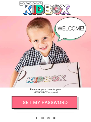
Ask inactive customer to verify their accounts – again
Here’s a email to send customers who haven’t engaged with your rewards program. Jackrabbit extends a bonus to customers who either didn’t activate their Run Rewards accounts or haven’t registered activity. It reminds customers of the benefits and includes first-name personalization in the subject line to attract more attention.
Sign up free for 130 curated examples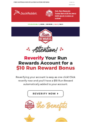

Want to explore account confirmation emails?
for MailCharts to discover account confirmation campaigns and inspired!
Account confirmation implementation details
The content for account emails is pretty straightforward but given these emails are likely the first email to a user, ’s important to the setup correct. This is especially true for those users who do not explicitly opt-in to communication.
Remove users who do not opt-in to receive communication
If using account emails to confirm their to a newsletter or account creation and the user does not perform the opt-in action, remove them from the database. This is especially important for citizens in the EU given GDPR but is a best practice as data privacy regulations come into effect.
Trigger emails after users fill out a form on the website
This ensures there’s little to no delay between and account . If sent a few days later, the customer may not remember what they signed up for and ignore the call to action to opt-in. This also confirms with the customer that a company has their form submission.
Mark email addresses invalid for those who have bounced
There are two types of email bounces: hard and soft bounced emails. Email addresses that have hard bounced should be marked invalid immediately and soft bounced emails should be marked invalid after a few attempted sends. This is crucial to ensure your IP maintains a positive reputation.
Looking for more email examples? MailCharts tracks emails for 100s of top brands! Sign up for free to view more examples and email sequences.
Subject lines strategy: How to get inbox attention
Account emails reach your customers at a pivotal moment early in their journey with your brand. Confirming their accounts moves them another step closer to a first and starts the data-collection process. So, they must stand in overloaded inboxes with attention-getting subject lines.
The email samples below use several approaches to effective, attention-getting inboxes that drive value for customers and invite them to open and click. Use this list as inspiration for testing subject lines to see what works with your own audience!
- Sugarfina Candy Concierge: 20% Off Just For You. Welcome to Sugarfina!
- Etihad Airways: Important – activate your membership in just two steps
- Jackrabbit: Debra reverify your account in 1 click for a $10 bonus!
- Reebok: ACTION NEEDED: Your Reebok UNLOCKED Account
- Eastbay: Validate your new FLX account to rewards.
- CVS Pharmacy: Please Confirm Your Email Preferences, Caroline.
- Christmas Tree Shops: **ACT NOW** We’re Emailing to Confirm Your to Coupons and Emails!
- Atlassian: there! Please verify your email address
- Lime Crime: You’ve created a Lime Crime account, babe!
- Foot Cardigan: to activate. Beep bop boop.

Want to explore account confirmation emails?
for MailCharts to discover account confirmation campaigns and inspired!

