Shipping Confirmation Email Examples
In e-commerce it's important to quickly confirm a purchase and provide a record for customers. Seems easy enough, right?
Explore all 218 shipping confirmation emails
Sign-up for MailCharts to discover shipping confirmation campaigns and get inspired!
Pro tip: Scroll down for hand-picked emails.
Shipping confirmation emails are sent when a product the customer has bought has been shipped to them. They are not the same as receipt emails, which are sent when the customer has placed their order but before the order is shipped.
This type of transactional email is not a big revenue driver since the customer’s priority when receiving their shipping confirmation is to get all the details necessary for them to track their order and know it’ll get to them on time.
However, transactional emails do tend to get high open rates since customers want to know that their order has shipped (or that their order has been received, in the case of a receipt email), whether there are any potential delays in the delivery, and what the estimated delivery date of their purchase is.
To help you get your shipping confirmation email templates on-point, we’ve gathered some great examples of other ecommerce brands below.
View shipping confirmation emails and strategies
- 1 Offer information about shipped products
- 2 Use a clear subject line
- 3 Highlight the expected delivery date
- 4 Include product recommendations to drive future purchases
- 5 Provide contact information
- 6 Invite the customer to join your loyalty program
- 7 Mention social media pages
- 8 Show them how to use your product
- 9 Talk about an ongoing campaign
- 10 Explain the exchange and returns policy
- 11 Highlight any special requirements for delivery
- 12 Promote your referral program
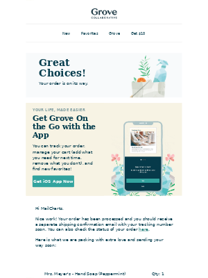
- 13 Share the link to your mobile app
Learn how to create shipping confirmation campaigns

Want to explore shipping confirmation emails?
Sign-up for MailCharts to discover shipping confirmation campaigns and get inspired!
Shipping Confirmation Email Strategies
Let’s get straight to the content. What works for confirmation emails? What content do customers care about? Here are a few great examples of shipping confirmation email campaigns to get started:
Offer information about shipped products
Baby food delivery company Little Spoon starts its email with the most important information: the tracking link. What follows next is what makes this transactional email special: a guide on getting started with the brand’s products.
The guide does several things. First, it reassures the customer that their products will stay chilled and fresh in case they’re not there when the delivery comes. Then, it makes sure parents give their products a fair chance even if their baby doesn’t like them from the get-go, and next, it naturally includes a CTA for the recipient to “explore boosters”, another type of Little Spoon product. Cross-selling like this is a great tactic to encourage customers to head back to your online store post-purchase.
Lastly, Little Spoon reminds the customer of its environmentally-friendly packaging.
This email is a great example of how you can turn a transactional email into a fun message by letting your brand voice shine through, providing valuable information, and packaging it all with some great graphic design.
Sign up free for 218 curated examples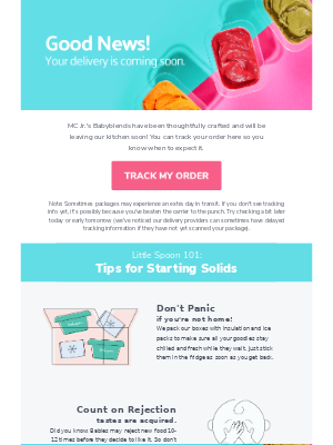
Use a clear subject line
Puma knows what the customer has been waiting for and so their subject line lets them know: “Your Puma order has shipped!”
The body of this shipping email includes multiple tracking links – one behind the big red button and one behind the tracking number – as well as the actual tracking number and all other information necessary for the customer to know what’s up with their order, such as the order number, the ordered product’s specifications, the shipping method, and both a phone number and email address to contact customer support.
The single-column design of the email keeps things simple, keeping the focus entirely on the shipping notification.
Sign up free for 218 curated examples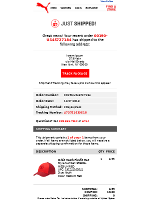
Highlight the expected delivery date
By including the delivery date, brands can set expectations so shoppers don’t impatiently start contacting your support team asking where their order is. Intimates company Adore Me shares the expected delivery date range right by the shipping method and tracking information in bold letters. This makes it easier for customers to do a quick skim of the email and get the information they need.
There’s no doubt that the main message of this email is the shipping confirmation, but Adore Me does also do some cross-selling by promoting its new arrivals at the bottom of the email. The promotional banner stands out as it uses different colors than the rest of this email template.
Sign up free for 218 curated examples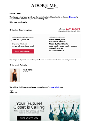
Include product recommendations to drive future purchases
This is another example of how shipping confirmation emails don’t need to be complicated. Nike teases excited customers with a subject line that asks them if they’re looking for their order. The brand then shares the tracking link at the very top of its email, followed by all essential order information. Another link to check on the order status closes off the transactional content of the email before Nike suggests some other products that could be a good fit for the recipient. Adding relevant product recommendations like this can lead customers to their next order quickly.
Lastly, we love the “Get Help” section at the bottom of the email, linking to specific support resources. This is a good way to give customers easy access to additional information without needing to stuff your email.
Sign up free for 218 curated examples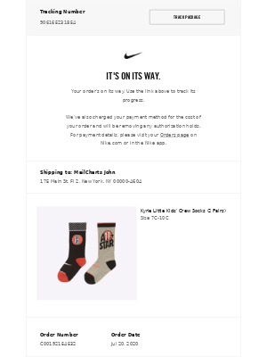
Provide contact information
Make it easy for the customer to contact you with any questions about the shipping and delivery process. In their confirmation email, tarte included an email address, phone number, and hours when to contact the customer service. This information isn’t hidden away at the bottom of the email but is shared even before the order summary, which sits on the right side of the email. The brand also allows customers to turn on updates to get simple notifications when something changes for their order.
The purple boxes in multiple columns provide a clear way to organize the information in the email, while the darker purple banner entices the customers to “shop new arrivals.”
Sign up free for 218 curated examples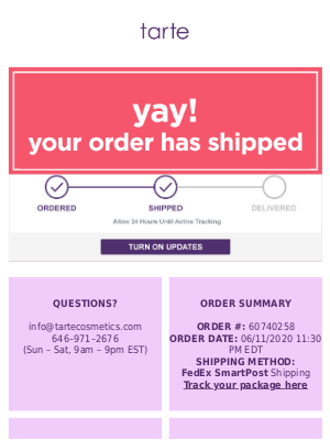
Invite the customer to join your loyalty program
If you have a loyalty or rewards program, consider mentioning it in your shipping and delivery email. People who just bought from you are excited to get their purchase and inviting them to your program is a great way to keep up the momentum and build customer loyalty. That excitement is also likely to get you good conversion rates for your invitation.
In this example, Brooklinen added a section at the bottom of the email to invite the customer to join its program and earn credits towards their next purchase.
Sign up free for 218 curated examples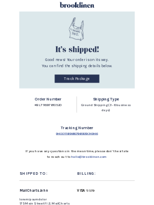
Mention social media pages
Chubbies includes tracking information and all the other necessary ingredients of a good confirmation email, but then it gets creative. The brand invites customers to engage with its community on social media and to tag it in their posts. The fun photos and copy make Chubbies’ brand personality stand out and are in line with the tone of the rest of its email marketing messages. This example shows that confirmation emails don’t need to be boring.
Sign up free for 218 curated examples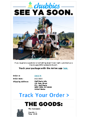
Show them how to use your product
When a customer purchases for the first time from your brand, make sure to provide guidance on how to use the product. Clothing brand Dia & Co uses its shipping confirmation email to explain how to make the most of our first box with a step-by-step guide. The copy explains what to do, while the images add a nice touch that helps the customer imagine what it’ll be like to try their first box.
Sign up free for 218 curated examples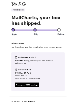
Talk about an ongoing campaign
A customer completed a purchase and the package is on the way – great! The same person may benefit from another product or deal that you’re offering, so make sure you inform them about any ongoing promotions. ThirdLove does that by talking about “3 for $30” offer at the bottom of the shipping confirmation email.
Other things this email does well is reminding customers of the brand’s generous return policy, it communicates clearly when its support team is available, and it lists a few recommended products.
Sign up free for 218 curated examples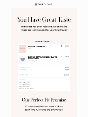
Explain the exchange and returns policy
A shipping confirmation email is a great place to share details about your exchange and returns policy. You can include a quick note or go into more details like oVertone did at the bottom of this email.
oVertone also has a clear CTA for the customer to view their order status, paired with a cheeky invitation to “do a little extra shopping.”
Overall, this is a simple email that still manages to convey one of the most valuable messages your customer will get from you in a fun way.
Sign up free for 218 curated examples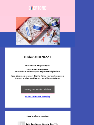
Highlight any special requirements for delivery
Are there any special requirements for successful delivery? Make sure you communicate them in the shipping confirmation email and ensure the customer has a positive experience. In this example, Winc used big, bold text to emphasize that someone aged 21+ needs to sign for the package. The information goes right below the order summary with the order number and other information. Because of the big font and its position, it’s impossible to miss.
Sign up free for 218 curated examples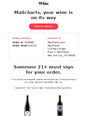
Promote your referral program
While it does provide tracking information once you click the link, Ritual does not include other information like shipping address or delivery date in their shipping confirmation email. Instead, the brand uses the space to talk about its referral program and how the customer can earn credits if they refer a friend. It also links to one of its social media channels (Instagram).
Sign up free for 218 curated examples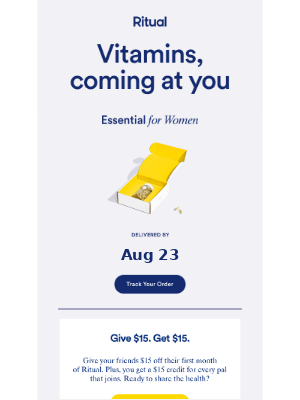
Bonus marketing tip: Consider incorporating real-time mobile alerts for shipped items. This gives real-time updates to the customer on where their package is in transit without incessantly clicking through the tracking number in the email multiple times or having to check their email.

Want to explore shipping confirmation emails?
Sign-up for MailCharts to discover shipping confirmation campaigns and get inspired!
Shipping Confirmation Best Practices
Shipping confirmations are transactional emails that are focused on providing the customer with the most important information about their purchase. These order details ideally include:
- the name and an image of the purchased product(s)
- the order date
- the order number
- a tracking link
- the product price
- shipping details, including the shipping address
- the billing address
- the customer’s payment details, including their payment method
- your contact number and/or a customer support link
Below, you can find some more tips on how to start optimizing your confirmation emails and create better shipping confirmation email templates.
Populate order details with tokens
Use data from the purchase order to populate details like the item, order number, price, and shipping address for the purchased item. Most email service providers (ESPs) include the ability to personalize using such data from a transaction.
Wait until after the receipt email
Like we’ve noted above, customers should receive the confirmation email after the receipt email is sent. Sending it beforehand can lead to a confusing user experience especially if the item purchase price and details are not highlighting within the confirmation email.
Send transactional emails to unsubscribed users
This is permissible under GDPR as it’s deemed as a legitimate interest. However, it’s crucial to clearly state this in the company’s privacy policy and to read up on GDPR best practices. Understand best practices before sending your shipping confirmation email.
Go for the cross-sell
A customer who’s excited about receiving their newest purchase might also be interested in complementary products. Try adding a few product recommendations to your shipping confirmation as a late cross-sell tactic.
Create shipping confirmation email templates
Email templates don’t just come in handy when you’re creating new marketing emails. They also act as the default when doing A/B testing. Since confirmation emails tend to have some of the highest open rates, it’s a good idea to experiment with them. Create shipping confirmation email templates for the different segments of your audience and then run tests.
Add a cross-sell, offer a discount for a future purchase, invite customers to follow you on social media, or try some of the design tips shares in the examples above.
Experiment with your subject lines
Since customers are waiting for their order, it will help your open rate when you make sure that shipping confirmation email subject lines communicate that a customer’s order has been shipped. Alternatively, you can hint at the shipping, but you don’t want the subject line to be so vague that customers don’t know what it’s about. Experiment with the formulation more than the actual message to see if you can increase open rates.

Want to explore shipping confirmation emails?
Sign-up for MailCharts to discover shipping confirmation campaigns and get inspired!

