Browse abandonment email examples
Browse abandonment is a strong customer behavior signal with a great chance to convert to purchase. Discover fresh browse abandonment email examples, strategies and tactics that help you reach the right customers with the right messages at the right time.
Explore all 183 browse abandonment emails
Sign-up for MailCharts to discover browse abandonment campaigns and get inspired!
Pro tip: Scroll down for hand-picked emails.
Much like cart abandonment, its more popular sibling, browse abandonment emails allow retailers to connect with consumers at the right time with (potentially) the right product. Although these customers are several steps away from purchasing when compared to cart abandoners, browse abandonment sends a strong behavioral signal. If you can detect this signal and respond at the right time with a helpful message, you gain another chance to persuade your browser to come back to your site and buy.
View browse abandonment emails and strategies
- 1 Use website data to your advantage and personalize the content based on categories of interest.
- 2 Highlight the benefits of purchasing from the brand
- 3 Personalize the subject line to include specifics of their search
- 4 Be strategic in your launch time
- 5 Start the conversation right with the subject line
- 6 Soft-pedal the push to convert …
- 7 … But don't be afraid to ask for the sale
- 8 Announce price drops on recently browsed products
- 9 Help customers feel sure they're in the right place
- 10 Conquer price hesitation with payment alternatives
- 11 Go big on your brand's chief benefits
- 12 Don't forget the preheader
- 13 How and when to use FOMO
Learn how to create browse abandonment campaigns

Want to explore browse abandonment emails?
Sign-up for MailCharts to discover browse abandonment campaigns and get inspired!
Browse abandonment strategic recommendations
It’s a misconception that you must offer an incentive, like a discount or free shipping, in your browse abandonment email templates to entice your browsers to come back for a second look or to buy. Try one of the strategies below to creative a more persuasive browse abandonment email journey instead of using incentives that cut into your margins.:
Use website data to your advantage and personalize the content based on categories of interest.
Guide customers towards products that make sense or would accompany the items they’ve searched for. Take a look at this email example from home retailer, Parachute Home’s strategy. They not only highlight the product the shopper was looking at, but they also provide a curated list of three related products within 24 hours of browsing.
Sign up free for 183 curated examples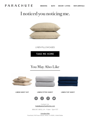
Highlight the benefits of purchasing from the brand
Since these shoppers are likely lower intent than cart abandoners, emphasize core competencies like the return policy or free shipping. Check out this example from Urban Decay. They keep the messaging direct and have clear language around their return policy as well as contact details for their customer service team.
Sign up free for 183 curated examples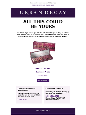
Personalize the subject line to include specifics of their search
Travel companies tend to do this well by adding details based on where customers are interested in visiting. For example, this email from Airbnb with the subject line: “Travel tip: Book your Seattle trip at least 1 month in advance”. This particular email gets sent within three hours of searching the Seattle area for rentals. Sending emails with top-of-mind details like this can engage and invite the customer back to the site sooner, rather than later.
Sign up free for 183 curated examples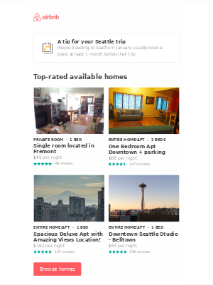
Be strategic in your launch time
Sending too soon after your browser leaves your site means you could be chasing people who clicked on your email by accident or discovered quickly that your product didn’t meet their needs. Lancome’s email goes out the day after the browse session. It personalizes the content using a conversational voice, such as saying “yesterday” instead of “recently.” This can make browse abandonment email send a “check-in” message instead of a “checking-up-on” message.
Sign up free for 183 curated examples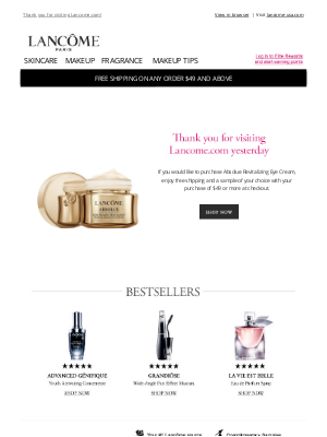
Start the conversation right with the subject line
Your browse abandonment email subject lines are your shopper’s first notice that you’re following up on their visit, so you must set the right tone. Allen-Edmonds goes right to the incentive in their email: “Enjoy 10% off.” Will this work for your browse abandonment emails? And should you deliver an incentive in your first email? Test both ideas to see which one converts more browsers into buyers!
Sign up free for 183 curated examples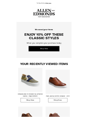
Soft-pedal the push to convert …
Browse abandoners are not as committed to buying as cart abandoners. So, instead of hitting them at the start with classic tactics like fear of missing out or dropping a major incentive, try an approach like Eastbay’s. The athletic-gear brand leads its email to browse abandoners with a thank-you before moving into recapping the browse session. One nice bonus in this email: The subtle benefit of joining the brand’s loyalty program. Note: FOMO does have a place in your browse-abandonment journey! Keep scrolling to find out how and when.
Sign up free for 183 curated examples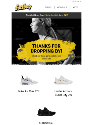
… But don't be afraid to ask for the sale
Although browsers don’t necessarily have fingers hovering over the “Checkout” button, they did make their way to your product page. So, you can assume that unless it was a fluke, they do have some interest in your wares. If you’re not sure how to strike the right tone, see how Tentree’s browse abandonment email pulls off this delicate balancing act. It’s indirectly persuasive because it features the benefits of buying from the brand, but it leads off with an invitation to reconnect instead of an expectation for buying. But it also includes the products the customer browsed with a direct link to the product page.
Sign up free for 183 curated examples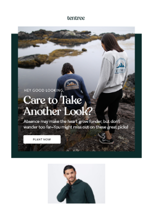
Announce price drops on recently browsed products
Who doesn’t like a bargain? See how Uniqlo plays on shoppers’ love of a bargain in its browse abandonment email to attract bargain-shoppers who might have left the site because of price. Try using this tactic to connect with shoppers who browsed the product over a longer period of time but didn’t buy. Revealing the lower price on the website instead of in the email can entice motivated recipients to click.
Sign up free for 183 curated examples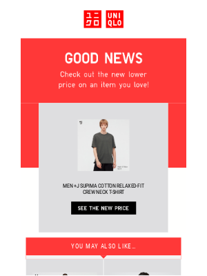
Help customers feel sure they're in the right place
When your business is beauty, you know your customers are looking for products that are just right for their skin or hair. Browsers often skip from site to site looking for that right fit, which is why this browse-abandonment email from Bliss is so appealing. It pairs the products a shopper browsed with complementary items in case the first browse round didn’t reveal the products they wanted. The email’s assured tone is persuasive, too.
Sign up free for 183 curated examples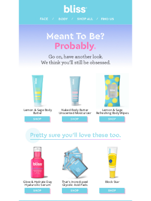
Conquer price hesitation with payment alternatives
On high-ticket items, price-conscious shoppers might find the right product, but they could balk at the prospect of adding the full amount to their credit cards. With buy now/pay later options so popular today, offering the option could persuade customers to convert. Your browse abandonment email should highlight the services you use. Zinus starts right in the subject line: “Still Deciding? Buy Now, Pay Later.” In the email itself, the copy features its BNPL service in several locations.
Sign up free for 183 curated examples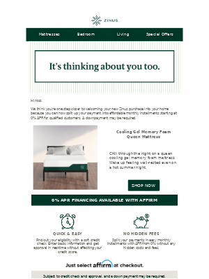
Go big on your brand's chief benefits
If you assume your browsers are visiting your competitors as well as your own site, it will help you focus on selling your brand value first before promoting your products. PetPrescription focuses on price in this browse-abandonment email example, highlighting its lower prices even before sharing the products their customer browsed. Plus, the appealing photo helps the message connect with their pet-loving customers.
Sign up free for 183 curated examples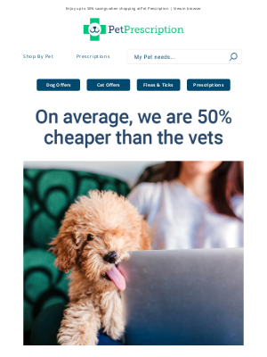
Don't forget the preheader
Your browse-abandonment email is the virtual equivalent of the shop clerk who steps in when a customer is looking around but not finding what they want. That makes helpfulness a necessary tone in an abandonment email instead of a hard sell. Use every detail in the email to emphasize how you can help customers – including the preheader! This Lids email begins with a friendly subject line (“Thanks For Stopping By…”) and sets the tone with this preheader: “Can we help you find anything?”
Sign up free for 183 curated examples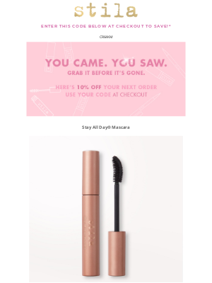
How and when to use FOMO
FOMO, or the fear of missing out, can be a great motivator in both browse and cart abandonment emails, as long as you know the best time to use it. Testing can help you find the optimal time in your abandonment journey to add a little push. So, when the time is right, consider this email from Stila, the second in its 2-email journey. That’s where Stila adds its incentive and a little more persuasive copy.
Sign up free for 183 curated examples
Pst… here’s a quick tip! Think of browse abandonment as a larger integrated marketing strategy. Consider running retargeting ads on Facebook or Instagram in addition to email communication.

Want to explore browse abandonment emails?
Sign-up for MailCharts to discover browse abandonment campaigns and get inspired!
Browse abandonment implementation details
Browse abandonment emails rely heavily on data within the marketing stack. Browser activity must be collected to compile recently browsed items and keywords. Below we outline some tips to get started:
Trigger emails based on web page views, and add a waiting period
Depending on the company, a longer waiting period might be more effective. For bigger purchases like an airline flight or furniture, it might make more sense to schedule your email to launch 12 to 24 hours after browsing if the user hasn’t converted yet. Test a few different wait periods to see what length of time drives the highest conversion.
Exclude those who bounce from a product page within a few seconds
These users might have clicked accidentally or are not interested in the product. Focus on users who have spent more time on-site and have clicked at least a few pages during their visit.
Test the flow of data
Ensure your website data is accurate and working appropriately. View multiple web pages with a test email account and check the resulting data within your email service provider (ESP) or data warehouse. Your data or engineering team should be able to help with this. For emails that rely on personalization, QA your data and email templates to be sure they’re accurate. An email with the wrong item or a broken email could create a poor user experience.
Worse yet, browse abandonment can deluge your users with a firehose of emails—particularly the most active users on your site. Ensure you have filters in place to control the frequency at which your email platform triggers browse abandonment emails, especially if your recipients already receive your regular promotional emails.
Psst … here’s a quick tip! Think of browse abandonment as part of your larger integrated marketing strategy. Consider running retargeting ads on Facebook or Instagram in addition to email communications.
Trigger emails based on web page views and add a waiting period
Depending on the company, a longer wait period may be more effective. For example, bigger purchases like an airline flight may make sense to schedule 12-24 hours after browsing if the user hasn’t booked yet. Test a few different wait periods to see what length of time drives the highest conversion.
Exclude those who bounce from a product page within a few seconds
These users may have clicked accidentally or are not interested in the product. Focus on users who have spent more time on-site and have clicked at least a few pages during their visit.
Test the flow of data
Ensure the website data is accurate and working appropriately by viewing multiple web pages with a test email account and viewing the resulting data within the email service provider (ESP) or data warehouse (the data or engineering team should be able to help with this!). For emails reliant on personalization, QA is essential. Send the wrong item or a broken email and it could result in poor user experience.
Worse yet, browse abandonment can deluge your users with a firehose of emails—particularly the most active users on your site. Ensure you have filters in place to reduce the frequency with which browse abandonment mailers are triggered!
Pst… here’s a quick tip! Think of browse abandonment as a larger integrated marketing strategy. Consider running retargeting ads on Facebook or Instagram in addition to email communication.

Want to explore browse abandonment emails?
Sign-up for MailCharts to discover browse abandonment campaigns and get inspired!
