New Customer Welcome Email Template Examples & Strategic Tips
Engage new shoppers from the start with smart welcome emails.
Explore all 242 welcome emails
Sign-up for MailCharts to discover welcome campaigns and get inspired!
Pro tip: Scroll down for hand-picked emails.
Welcome emails have open rates that are 50% higher than those of regular email sends and they generate no less than 320% more revenue per email than other promotional emails. Those are welcome email statistics you can’t ignore. If you want to keep a new subscriber interested in your brand and make them convert, sending them a welcome message is the smart thing to do.
But you only have one chance to get that first email right. How do you go about it?
We’ve selected some new subscriber and new customer welcome email template examples you can use as inspiration to create your own welcome campaigns. These come straight from our database where you can find welcome email templates used by thousands of other ecommerce brands. Sign up today and check them out.
Welcome Email Examples and Strategic Tips
- 1 Talk about product details
- 2 Review reward program benefits
- 3 Use GIFs to showcase your products
- 4 Personalize the subject line
- 5 Let new subscribers know what to expect
- 6 Remind new customers about the welcome offer
- 7 Promote your social media channels
- 8 Introduce your referral program
- 9 Showcase your best-selling products
- 10 Offer a free trial product
- 11 Share free content
- 12 Talk about materials and production process
- 13 Highlight your brand values
Learn how to create welcome campaigns

Want to explore welcome emails?
Sign-up for MailCharts to discover welcome campaigns and get inspired!
Welcome Email Examples and Strategic Tips
A welcome message should feel personal, friendly, and warm. There are a lot of things you can work with, from your welcome email subject line to the content in the email body and the CTAs you include.
Read on for some great welcome email templates from other ecommerce brands.
Talk about product details
Supplement company, Objective starts its onboarding welcome email by clearly stating what they have to offer (“science-backed solutions for better sleep, more energy, balanced moods and more”) in combination with a hero that showcases some of their top products.
The purple banner makes the discount code with CTA button stand out and if new email subscribers read on, they find a summary of Objective’s core values and what they can expect from the brand.
Lastly, the company name is mentioned in the email subject line, the email header, and at the top of the content, ensuring that the recipients remember whose list they signed up to.
Sign up free for 242 curated examples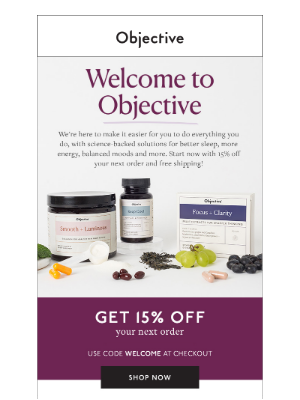
Review reward program benefits
Some companies refer to new account holders or subscribers as reward members and address them as such in their welcome messages. Swarovski, for example, lists all of the benefits of its reward program in this personalized welcome email to new members.
Instead of including a CTA that leads to their store, Swarovski invites new subscribers to read about their history. This makes more invested in the brand.
Sign up free for 242 curated examples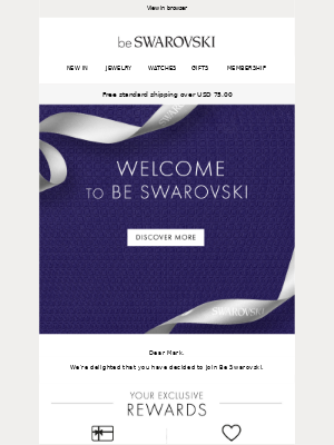
Use GIFs to showcase your products
This product-focused email by Hickies uses GIFs to showcase the special Hickies laces and how to use them. It’s an approach that works great when it’s easier to show, rather than tell your email list how your product works. Just make sure to include alternative text in case your recipients’ email client doesn’t render GIFs well.
Notice how this email includes two calls to action: one to “shop now”, and another one leading new users to helpful resources that teach them how to lace their Hickies.
Sign up free for 242 curated examples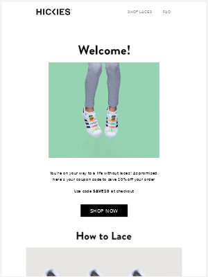
Personalize the subject line
Personalized emails work great to make new subscribers feel appreciated and FTD Flowers does a good job with this one. Already in the subject line, they extend Cathy a warm welcome by using the heart emoji and telling her they’re “so glad” she’s signed up.
The email itself contains a discount code for Cathy’s next purchase, but maybe even more important is how it lists the company’s promise as well as information on how the recipient can customize her FTD experience.
We also love how easy FTD Flowers makes it to reach their support team by listing several contact options.
Sign up free for 242 curated examples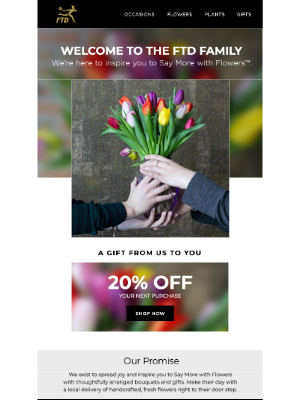
Let new subscribers know what to expect
Avoid becoming an unexpected surprise in your new customers’ mailboxes and use your welcome email to let them know what they can expect. In this email, Cure sums up what new subscribers can expect from future emails in a single sentence.
To say thank you for signing up, they offer a 20% discount, enticing new subscribers to make their first purchase. The additional free shipping makes the offer even more inviting.
It’s a short and sweet first message that gets a lot of things right.
Sign up free for 242 curated examples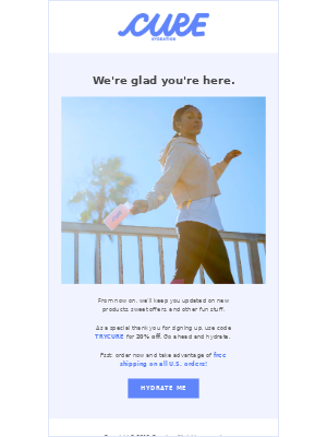
Remind new customers about the welcome offer
Sharing a welcome discount code is a good strategy, but what if your new customers didn’t use it? Do what Columbia Sportswear does and remind them in one or a few more follow-up emails. Nobody said your welcome should be limited to one email. you can create a whole welcome series if it makes sense and set up an automated workflow that dictates when each email gets sent.
If you have physical stores as Columbia does, consider creating a scannable discount so subscribers can choose whether they use it in your online store or in one of your physical shops. And don’t forget to create some sense of urgency by having an expiry date for your coupon.
Sign up free for 242 curated examples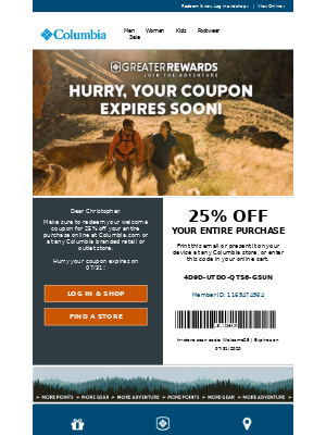
Promote your social media channels
Bags and luggage brand BABOON sends a colorful email that shares what to expect from its emails in a playful way that works well for its target audience.
While there is a bright CTA inviting subscribers to visit their store, BABOON clearly also wants people to follow them on Instagram and draws attention to this through clever graphics. Social media channels lend themselves well to creating an amazing community and so you want to get new and potential customers on there as quickly as possible.
Another reason to offer an alternative to the “shop now” call to action is that new subscribers might not be far along enough in the customer journey to buy, and so you want to offer them another way to engage with you.
Sign up free for 242 curated examples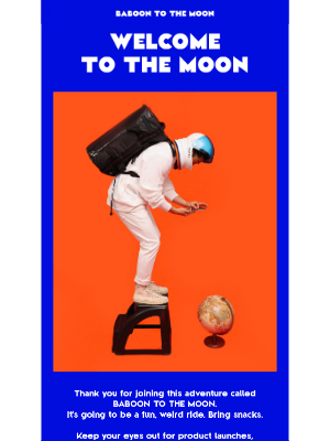
Introduce your referral program
Your welcome email content is a great place to introduce your referral program. People who’ve just signed up are excited about your brand and more likely to share it with others.
The big blue banner in Goby’s email draws the recipient’s attention to the “get your link” call to action, but there’s something else going on here as well. The text above shares how subscribers can manage their info, settings, and referral wins by logging into their account, and their account is also where they need to get their referral link.
Aside from promoting their referral program, this email also uses that referral program to get new subscribers over to their account page where they’ll hopefully check that their data is correct.
Sign up free for 242 curated examples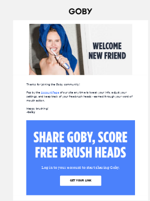
Showcase your best-selling products
GOAT sends a product-focused welcome that is all about highlighting items that should have a good click-through rate. It has a single message: their store is the place to discover new drops, future releases, and products that sold out elsewhere. The hero GIF at the top of the email gives readers outfit inspiration and while GOAT does also sell clothes and accessories, the rest of the email contains mostly personalized content. You can bet it was dynamically put together for someone who was browsing sneakers when they signed up.
Dynamically populating your welcome email sequence with relevant content to the shopper is a great way to increase user engagement and can easily be done through marketing automation.
Sign up free for 242 curated examples
Offer a free trial product
Dermatologica’s email starts with an engaging subject line that drips into a free trial offer. To get their best skin ever, subscribers will want to try the mini microfoliant they’ll get for free with their next order. To make the offer more enticing, Dermatologica lists several of the product’s benefits as well as a five-star rating as social proof.
Offering a mini version of a product as a free trial is a great way to let people trial a product.
On top of that, the email shows recipients how they can get helpful tips for their skin: by using Dermatologica’s face mapping service or by chatting to a skin therapist.
Sign up free for 242 curated examples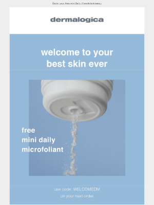
Talk about materials and production process
If high-quality materials and unique design are what make your products stand out, make sure to communicate that in your email. Mack Weldon uses its welcome email to talk about the premium materials and smart design of their products and the email ends with them linking to the most popular product categories. By using phrases such as “what we believe in” and “we’re on a mission”, the brand takes a stand for something, making it easier to establish a meaningful connection with new customers who share the same values.
Sign up free for 242 curated examples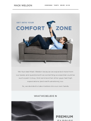
Highlight your brand values
What are the key values that set your brand apart from all the other brands? Highlight what makes your brand special to help new customers feel more connected. Tracksmith’s welcome message is a great example of this done beautifully by sending a short email that talks about the brand’s beliefs and values. Also, notice how the subject line reads “welcome to the team”. By calling the new subscriber a team member, Tracksmith starts building a community from their first email.
Sign up free for 242 curated examples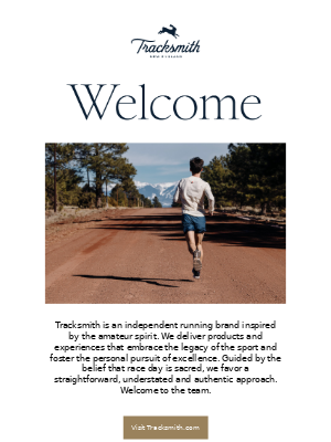

Want to explore welcome emails?
Sign-up for MailCharts to discover welcome campaigns and get inspired!
Welcome email implementation tips
First impressions matter and a solid welcome email can create a great first impression. The examples above can be used as inspiration for your own welcome email templates. Below, we list a few more general tips to create an effective welcome email series.
Exclude subscribers from other email sequences
Avoid bombarding new subscribers with too much information or other promotional emails. Consider excluding recent sign-ups from other campaigns so you keep people away from that unsubscribe link.
Email immediately
Wait too long to send your welcome message, and subscribers may forget they signed up for your list. To avoid that, set up a triggered campaign that fires anytime a new user completes a signup form on site. They’ll receive your automated emails without you having to think about them.
Use your company name in the sender name
If new subscribers don’t know who’s emailing them, they might leave your email unread or send it to spam. That’s why you want to include your company name in the sender name.
Some brands send emails as coming from a person within their company to make them look less salesy, but even if you go that route, it’s a good idea to add your company name to avoid confusion. You could send your emails as coming from “MailCharts” or from “Megan at MailCharts” but avoid sending them as just coming from “Megan”.
Utilize preheader text to make the email more personal
Preheader text often gets overlooked. Most ESPs allow users to create preheader text without having to dive into the code. Typically, if a preheader is not determined, the email sender will default to pulling in text from the email message itself which may not always look great. You can turn preheader texts into extensions of your email subject lines, use them to generate curiosity, have them say “thanks for subscribing”, and much more.
In addition to examples of welcome emails, MailCharts also compiles entire email journeys so you’re able to see how other brands interact with their customers: From the initial welcome email to win-back emails. Sign up for the MailCharts pro plan to get access to this and more email stats.

Want to explore welcome emails?
Sign-up for MailCharts to discover welcome campaigns and get inspired!

