11 of the Best Email Design Examples and Strategies
Game-changing email designs to inspire your next email marketing campaign.
Explore all 241 great emails
Sign-up for MailCharts to discover great designs campaigns and get inspired!
Pro tip: Scroll down for hand-picked emails.
Email design can make or break the effectiveness of your email marketing campaigns. This is true for any type of marketing email, from promotional to transactional emails. Things like white space, color scheme, and CTA buttons are just a few of the elements that make up email design and impact whether your emails deliver a great user experience or not.
The two main goals of your email design are to reflect your brand identity and to drive the recipient to the main call to action.
This can be done in several ways, and so we’ve gathered some of the best email design examples from the MailCharts database to provide you with design inspiration and help you improve your email templates.
View our recommendations for great email designs
- 1 Show, don't tell
- 2 Design around the products featured
- 3 Keep things simple
- 4 Play with typography
- 5 Illustrate with icons
- 6 Zoom in on product details
- 7 Make it fun
- 8 Showcase social proof
- 9 Use GIFs to reveal your message
- 10 Incorporate branding into transactional messages
- 11 Embed attention-grabbing countdown timers
Tips for Great Email Design

Want to explore more emails we love?
Sign-up for MailCharts to discover great campaigns and get inspired!
11 Great Examples of Email Design
Each of the email marketing examples below uses a different strategy to provide a great user experience. Use them to refine your campaigns and make your newsletter design more effective.
Show, don't tell
Allbirds places a creative GIF within the frame of a mobile phone to show how the virtual shoe try-on feature of their app works. The brief description below the GIF explains to the reader what they’re seeing and is followed by a single clear CTA. The whole email sticks to a black and white color scheme, making the real-life colors of the GIF stand out even more.
Sign up free for 241 curated examples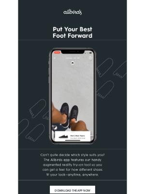
Design around the products featured
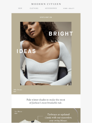
In this Modern Citizen product promotion email, the brand features white and cream clothing items and pairs those items with complementary background colors and matching model pictures. The color combinations create a blocked layout, with the hero image displayed in one big block at the top of the email. This color consistency aids in the flow of the email while adding an interesting composition instead of just featuring product images one after the other.
The result? A beautiful email.
Keep things simple
Using an email template like the one above from Modern Citizen can be time-consuming. Mejuri proves that a simple one-column design can work just as well. The email follows a steady pattern of big image > short description > call-to-action. The CTAs each link to a different landing page and serve to drive traffic to popular categories on the Mejuri store. This approach is more interesting than just doing a product feature and gives subscribers a lot of opportunities to click through.
Sign up free for 241 curated examples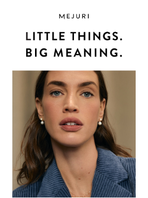
Play with typography
This email is a great example of how you can create a design element with just text. Adidas sends this email to recent buyers in order to get them to buy more and complete their look. It uses big and bold typography in combination with a ‘fill in the blanks’ approach to draw attention to its headline.
The headline is followed by dynamic content that recommends other products based on the purchase the recipient just made.
Sign up free for 241 curated examples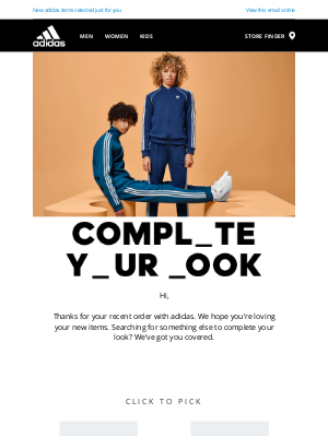
Illustrate with icons
Raised Real uses on-brand icons throughout this email campaign to explain how easy their subscription process is. It’s highly relevant content aimed at turning leads into customers and guides recipients straight to the bright discount offer and the call-to-action at the bottom of the email.
It’s a great example of how you can use icons to take subscribers through a step-by-step process.
Sign up free for 241 curated examples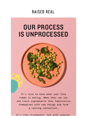
Zoom in on product details
This Monica + Andy email focuses on just one product: their lounge robe. Doing this allows the brand to highlight the product’s key features with text and close-up images of product details. Using arrows to explain what the recipient sees in every photo is a more fun way to provide information than simply listing a bunch of features.
Sign up free for 241 curated examples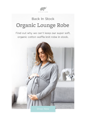
Make it fun
We tip our hat to the email marketer who came up with the concept for this hers email. It is unlike any other in our inbox. The brand incorporated a fun flowchart about its hair product. This is a great way to engage recipients instead of just talking about the product.
Sign up free for 241 curated examples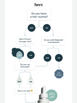
Showcase social proof
Venus Fleur takes social proof to another level with this email. It contains an animated GIF that shows how two top influencers rave about their brand on Instagram. Did Venus Fleur pay these influencers to promote them? Probably. Does this provide the brand with crazy social proof? Definitely.
Displaying the brand mentions as if they’re shown directly on a mobile phone adds to the realness of the social proof, not to mention that the phone with the moving images instantly grabs the recipient’s attention.
Sign up free for 241 curated examples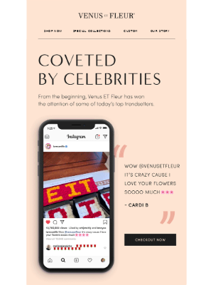
Use GIFs to reveal your message
GIFs offer an entertaining way to announce a promotion or share a message. In this email, home decor store Josh&Main uses a GIF that opens up to display a 10% discount. The brand also does a good job at repeating its message in simple text for those subscribers whose email client doesn’t render GIFs well, and for accessibility purposes.
The discount message is followed by six calls to action that all lead to different store categories, making it easy for the recipient to start shopping for what they’re interested in. Note how the color of the CTAs is the same as that of the discount offer text and the coupon code, yet stands out against the softer pink background of the GIF.
Sign up free for 241 curated examples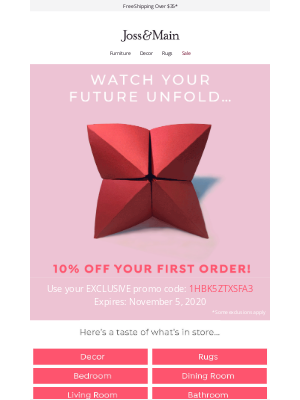
Incorporate branding into transactional messages
Shipping confirmation emails and other transactional emails are usually quite uninteresting in terms of design, but they are an opportunity to improve the post-purchase experience. This example from Kendra Scott directs purchasers to their package tracking and follows the same branding as their marketing emails. This creates a more seamless experience for purchasers, even though these emails aren’t necessarily revenue-driving.
Sign up free for 241 curated examples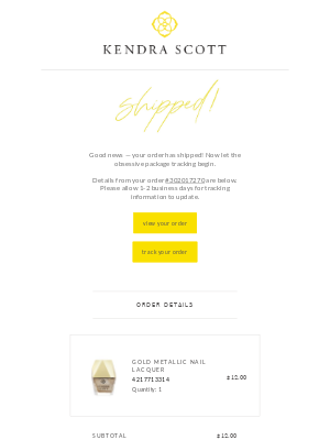
Embed attention-grabbing countdown timers
When emailing about a promotion, incorporate countdown timers to create a sense of urgency. In this example, RadioShack uses a countdown timer as part of their cart abandonment email to drive people back to their carts before it expires. The bright red border of the timer against the plain grey background literally highlights it and the animation itself is an eye-catching element as well. The red is repeated further down the email for the link and the call to action button that both lead to the recipient’s cart, as well as for important parts of the copy such as “free shipping” and “hassle-free”.
Sign up free for 241 curated examples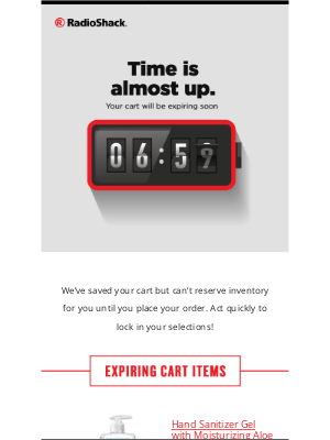

Want to explore more emails we love?
Sign-up for MailCharts to discover great campaigns and get inspired!
Email Designs: 5 Best Practices to Know
Okay, we admit it: it’s tricky to create a list of marketing strategies for creating email campaigns that stand out as their cool factor often comes from doing things differently. Still, there are a few things you can take into consideration if you want to create emails that delight your subscribers.
Use high-quality images
You don’t need to work with bland product studio images on white backgrounds. There are so many fun ways to create images. What matters most, is that your images are of high quality so they grab the user’s attention in a positive way. And if you want to place text over your images, make sure to use a complementary or another contrasting color so the copy is easy to read.
Experiment with your color palette
Colors are powerful design elements. You can create a whole mood just by changing the colors of your email. Experiment with using a black instead of a bright background, translate the feeling you want your products to give your customers into a color scheme, and test different popping colors for your calls to action.
Keep it mobile-friendly
This one should be obvious, but there are still email marketers out there that don’t seem to take into account how many people read their email on mobile devices. Having a responsive email design is crucial to getting your message across. If your emails don’t adapt to whatever screen size your recipients are using, a large part of them will disappear behind the edges of the screen, forcing users to scroll horizontally.
Test your emails across all email clients
Just as it’s important to check whether your emails display correctly on all types of screens, you’ll want to test send them to different email clients as well. This allows you to check whether all parts of your message are displayed correctly. It’s good practice to add alternative text for visual elements both in case they don’t render well and for accessibility.
Go beyond static images
Regular product photos can be great, but they’re not very original. Think of alternative visuals you can use, such as GIFs, icons, or unique illustrations. There are a lot of options, but don’t get too carried away either. Your visuals should always match your brand and be likely to appeal to your target audience.

Want to explore more emails we love?
Sign-up for MailCharts to discover great campaigns and get inspired!
