Delivery confirmation email examples
The final email within the shipping journey.
Explore all 93 delivery confirmation emails
Sign-up for MailCharts to discover delivery confirmation campaigns and get inspired!
Pro tip: Scroll down for hand-picked emails.
With many shoppers buying online, delivery confirmation emails are essential to verify a customer’s product has been delivered to its intended location. As these emails are a part of the purchase journey, they are transactional and should be flagged as such in the ecommerce platform or email service provider (ESP) depending on where you’re sending your delivery confirmation email from.
Note: Transactional emails can be sent to all purchasers, regardless if they’re unsubscribed from marketing communications. For more information on CAN-SPAM best practices for transactional emails, visit the FTC website.
View Delivery Confirmation emails and strategies
- 1 Highlight the delivery address
- 2 Consider mobile readers
- 3 Review return policy
- 4 Use font best practices to place emphasis on guarantee
- 5 Include item care instructions
- 6 Add customer service contact information
- 7 Combine several strategies within one email
- 8 Include order number in body copy
- 9 Include order number within preheader text
- 10 Prominently Feature FAQs
- 11 A more subtle approach to FAQ links
Learn how to create Delivery Confirmation campaigns

Want to explore delivery confirmation emails?
Sign-up for MailCharts to discover delivery confirmation campaigns and get inspired!
Delivery Confirmation strategic recommendations
These emails can have a similar look and feel to their receipts and order confirmation counterparts in the purchase journey. While the email will vary slightly, it’s important to call out a few strategies specifically for delivery confirmation:
Highlight the delivery address
Delivery confirmation emails should highlight the delivery address towards the beginning of the email so recipients can verify the address the item was delivered. Ralph Lauren does an excellent job of this by including the delivered address at the top of their delivery confirmation email before providing an overview of the products purchased.
Sign up free for 93 curated examples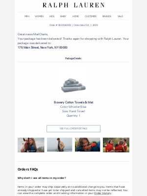
Consider mobile readers
Gap follows a similar format to Ralph Lauren and adds the delivery address ‘above the fold’ within their delivery confirmation email while highlighting product details next. Consider how mobile viewers will receive this information when creating the email.
Sign up free for 93 curated examples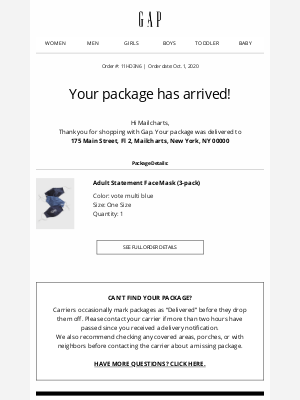
Review return policy
While the hope is customers love their new items, that’s not always the case. By including the return policy within the delivery confirmation email like the clothing company, Bombfell, brands can ensure a positive customer experience. Bombfell’s email contains a brief how-to on returning any unwanted products with the return label included in the package.
Sign up free for 93 curated examples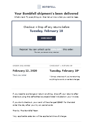
Use font best practices to place emphasis on guarantee
ThirdLove takes a similar approach with their delivery confirmation email by incorporating their Perfect Fit Promise directly under the products that were delivered. ThirdLove highlights the guarantee more heavily than the Bombfell email example with larger header text calling attention to the promise.
Sign up free for 93 curated examples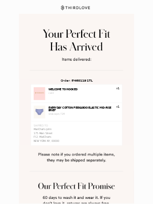
Include item care instructions
This strategy applies to many categories including luxury clothing, perishable foods, or living products (like flowers or plants). By including care instructions, customers are set up for success and are ensured a positive experience with their new items. Take a look at the flower delivery, Bouqs, confirmation example that includes detailed care instructions for the flowers delivered.
Sign up free for 93 curated examples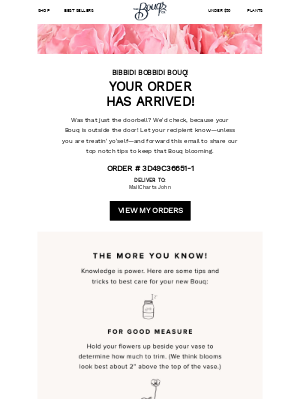
Add customer service contact information
Pet food delivery company, The Farmer’s Dog, includes contact information not-so-prominently in the footer of the email. This information doesn’t need to be front and center by any means, as long as it’s there and available should there be any delivery issues or concerns.
Sign up free for 93 curated examples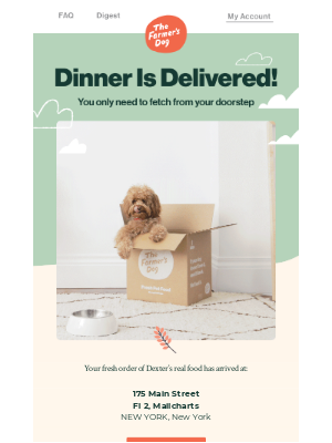
Combine several strategies within one email
Adding customer service information can be a quick addition to any purchase journey email. Rothy’s combines this strategy tip with a few others on this list for their delivery confirmation email leading to a great customer experience. Their contact information also includes SMS contact information which is not something we’ve seen a lot of (yet)!
Sign up free for 93 curated examples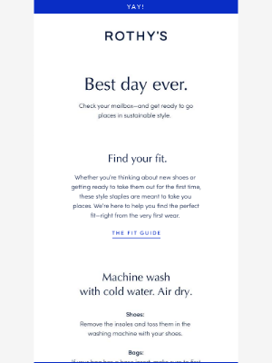
Include order number in body copy
This tip can apply to all purchase journey emails and be used within the email as well as the subject line for easy reference, especially for those with order issues or delivery troubles. Pottery Barn calls attention to the order number in their email in both the subject line and body of the email before any other purchase details.
Sign up free for 93 curated examples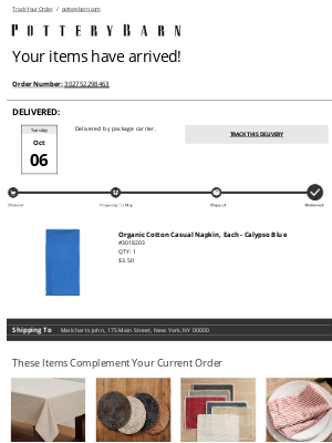
Include order number within preheader text
Abercrombie & Fitch is more subtle by adding the order number to the email preheader text instead of the subject line. The order number itself is more prominent within the email body, being featured before the order date and delivery address.
Sign up free for 93 curated examples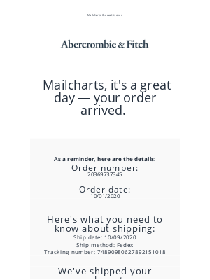
Prominently Feature FAQs
Reebok includes a clear CTA button for FAQs within their delivery confirmation emails and highlights a few popular topics with icons. This makes it easy for customers to quickly scan the email and select the appropriate topic depending on their question.
Sign up free for 93 curated examples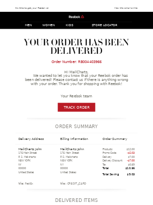
A more subtle approach to FAQ links
Other brands like Gucci may include a link in their footer to an FAQ page or elsewhere in the email for a non-conspicuous approach. Either approach works, as long as FAQs or customer service information is provided somewhere within the email!
Sign up free for 93 curated examples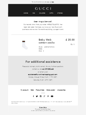

Want to explore delivery confirmation emails?
Sign-up for MailCharts to discover delivery confirmation campaigns and get inspired!
Delivery Confirmation implementation details
Like receipts and order confirmation emails, these emails are largely dependent on events and should be triggered based on a delivered product event. Delivery confirmation emails can be tricky depending on the different integrations and tools you use. Here are a few implementation insights for easy set up:
Dynamically populate order details
This is something you’ll want to test several times to ensure product details are properly flowing through the email. Many components of delivery confirmation emails include product ordered details, delivery address, and order number, all of which are important to get right to ensure a smooth customer experience. These details can be pulled in dynamically to your email service provider as fields. Read more on how to use order fields in your ESP’s documentation.
Use personalization tools to customize order tracking
Some personalization tools like Movable Ink and Zembula offer personalization for shipping journeys including a package tracking visualization that updates in real-time every time a shipping related email is opened (including order placed, item shipped, and delivered). Check out this example from Dia & Co that incorporates on-brand imagery to display where a package is at in the delivery process.

Want to explore delivery confirmation emails?
Sign-up for MailCharts to discover delivery confirmation campaigns and get inspired!
